
Sicura Health
As the Sicura Health app has not been launched to the public yet, I’m unable to showcase any project visuals or mention specific features at this stage. Consequently, certain parts of displayed images will be blurred or replaced with placeholder text.
Project Overview
Disease and disability are a huge cost to healthcare systems and can be devastating on people's lives. Much of this cost and loss is preventable. However, millions of people are unaware that they either have or are at risk of having serious health conditions. For those who are aware, adhering to their healthcare providers' guidance is too difficult.
In 2021, Sicura Health approached FST (my employer) to be partners in creating an app that monitors your health for health problems, uses AI-based predictive models to determine any future health risks, and automatically develops care plans for the user.
This app is designed for both iOS and Android. As the lead designer, my role is to oversee and execute the full design process of this app.
Client
Timeline
2021 - Present
Supported Platforms
iOS and Android
My Role
Design Lead
Design Software
Figma
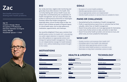
User Personas
Primary User Persona

Secondary User Personas

Information Architecture
Sitemap


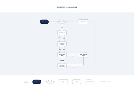
Flowcharts


Wireframes and High Fidelity Design
Screenshots and direct links to both Low and High Fidelity prototypes will be available here once the app is released to the public
Visual Design System
Colour System
Blue, often associated with trust, reliability, calmness, and comfort, is a fitting choice for a healthcare app. To facilitate information comprehension, a limited colour palette is used, ensuring visual clarity and reducing distractions. Predominantly using neutrals and shades of blue allows crucial information-bearing colours, such as red for urgency and green for positivity, to stand out

Typography
Montserrat is a versatile, clean and modern typeface. Its professional yet approachable appearance conveys a sense of reliability and trustworthiness, which is essential for healthcare app. Its legibility and clarity helps to effectively present medical information and instructions to users, fostering a user-friendly and accessible experience.


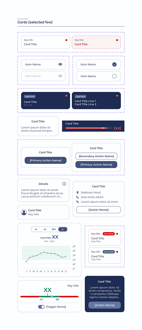
Components
As we embrace a Scrum framework (weekly to fortnightly sprints), it's imperative for the design system to exhibit scalability, flexibility, and ease of maintenance. Implementing the Atomic Design approach fulfils these requisites, as issues can be addressed by isolating specific components without impacting the entire app. With the colour system and writing style employed, there is a risk of the app feeling too serious, intimidating and rigid. To alleviate this concern, a medium corner radius — which feels more friendly and inviting — has been applied to most components

Accessibility
Colour Contrast
WCAG provides colour contrast ratios to guarantee optimal readability for users with visual impairments. In the development of the Sicura Health app, a colour contrast ratio tool and colour blind simulator were diligently employed to ensure compliance with these guidelines, validating that all text and visual elements meet the necessary accessibility standards
Colour Independence
A colour blind simulator was used to validate that key information and functionalities did not rely solely on colour to be understood. This ensures that the app is accessible to users with colour vision deficiencies or disability
Wording Interactive Elements
Following best practices in wording interactive elements (e.g. avoid ambiguous wording that’s not unique) to meet WCAG standards ensures that the app is accessible to all users, including those who rely on assistive technologies like screen readers to use the app
Styling Interactive Elements
Following best practices in styling interactive elements (e.g. ‘Calls to Action’ should stand out in a page) to meet WCAG standards ensures that the app is accessible and usable to all users, regardless of their abilities or disabilities
Learnings and Takeaways
Usability and Accessibility are Intertwined
Users with disabilities face greater challenges and frustrations. By prioritising accessibility, the app becomes inherently user-friendly for everyone. Disabilities and user-friendliness exist on a spectrum, and fully user-friendly products are typically the most accessible to those with disabilities. Hence, accessibility should be a priority, not a mere bonus to usability.


Better Collaboration with Developers
I've learned the immense value of proactively ensuring that the software development team understands the design as much as I do, as this leads to a more seamless and productive collaboration. Key benefits include less misinterpretations, a heightened ownership among developers to ensure that the implemented UI matches the design specs, and increased involvement in the design process (e.g. during implementation, they may highlight potential flaws or certain scenarios that the design hasn't catered for)
Human Interface Guidelines and Material Design
This project has led me to developing an extensive understanding of both HIG and Material Design guidelines, and the key differences between them. However, I learned the importance of balancing between adherence and individuality. In other words, rather than blindly following guidelines, I learned when to deviate from these guidelines to create the best user experiences
